-
Posts
1,636 -
Joined
-
Last visited
-
Days Won
67 -
Donations
0.00 USD
Content Type
Profiles
Forums
Events
Documentation
Bug Tracker
Downloads
Everything posted by Raap
-
Hey Threve, good write-up! Allow me to present two alternative tools: GIMP for image editing is a free tool and my tool of preference when it comes to doing anything texture related. It can do a lot of things and is as good as one can expect from free software. It lacks the shiny-shiny from expensive software like Photoshop, but it gets the job done. GIMP is primarily useful for pixel based scaling, making it ideal for game development. Get it here: https://www.gimp.org/ XCC Mixer is the tool most commonly recommended by W3DHub staff and it is the tool currently used for always.dat management. You can download XCC Mixer along with the APB development set (including W3D 5.x's new development tools, such as Mammoth), over here: https://gitlab.com/w3dhub/a-path-beyond-sdk As an extra note, DDS files require exports of a single layer (as Threve mentioned), but also keep in mind to ensure that your layers - all of them - always fit the canvas size. What your eyes see on screen is not relevant, if a layer does not match the canvas size then your exports will be faulty. Further more you do not want to keep your source file (be that a paint or GIMP project file) to remain as a single layer because doing so will make future revisions very hard. Convert to a single layer -> export to DDS -> UNDO LAYER MERGE -> save project! Lastly, one more important note; When opening DDS files in any editor you will be prompted to import MIPMAPS; do not do this, for editing you do not need mipmaps. On EXPORTING DDS files, it is of critical importance you generate new mipmaps with the export. These are embedded into the exported dds file, so there isn't anything extra to look for, file-wise. What are mipmaps? Essentially they are scaled down versions of your normal texture. They do something very important in-game however, and to keep the technical talk to a minimum; They ensure that image quality does not degrade significantly based on distance. If you've ever seen a texture in APB that looks very "grainey" at a distance and when moving (like the leaf piles on ToTheCore at this time of writing), it is because that file did not have mipmaps exported.
-
Some of Frank's solo albums have a lot of similarities with his work on C&C titles, specifically Morphscape, Rocktronic and Infiltrator have a number of tracks that sound like they would fit perfectly in the earlier Red Alert C&C games. Were these tracks at some point intended for these games, or is it purely just a matter of your music style preference? Bonus question: Any chance W3DHub projects could get non-profit, non-direct distribution rights to the mentioned albums, for inclusion within the W3D games (the music files would be stored inside game data, and used exclusively as level background music using the built-in music playlists where authors of music get full credit)?
-
4096x4096 yes please!
-
Honorable mention goes to this one!
-
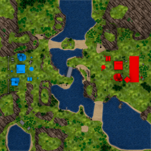
Based on some feedback I have updated the map render itself, to fix a few small oversights, add some extrusion to the airfield so it is more visibly the airfield and not a giant box, removed a large portion of the extremely jagged cliffs, and up-scaled the terrain textures significantly to reduce the 'noise' and make the map more clear. I also wanted to have depth layers based on request, unfortunately Max 8 has no way of rendering them intelligently, and manually drawing them would be inaccurate and very time consuming. This is my last submission on this map topic because this is where the proof of concept has to either, well, prove the concept, or not.
-
Meh, I do it all the time, especially on Under I pretty much only play Engineer when I'm Soviet due to the the hilarity of killing Allied vehicles with their own mines. I've gotten a ~90% accuracy on C4-tossing simply because I know I need to walk towards where I anticipate the enemy to be in 0.25s. This is a needed 'difficulty curve' because honestly C4 versus vehicles is extremely powerful, it one-shots most of them, and because very few people bring Engineers in their rides the drivers can often do nothing besides just considering the vehicle a loss. As for the CT (back on topic!), even after more usage I find it lacks sustainability and it makes the unit stressful to play as it is effectively a paper $2400 toy. It is horrible at dealing with buildings, even on Siege where this unit shines the most, 3-4 CT's can fail at destroying the Airfield as it takes about 45 seconds to blow it up without non-CY repairs (and from there no it gets progressively harder for each technician repairing the airfield). I remain fine with this, the idea that CT's just aren't meant for dealing with structures unless in overwhelming numbers, but it does need a survivability boost, either through a plain armor buff, or through a temporarily stronger buff for several seconds after chrono shifting, as I mentioned before. Anyhow, I absolutely am just repeating myself at this point so I leave it at this now! Edit: @Pushwall any more thoughts on the whole map thing?
-
The 'casting time' makes sense the way it is, it gives other players a moment to kill the C4 user before it is thrown. Rarely more time than a single shot, but it can be enough. Think about it, if anything 0.25s is too fast for placing and arming a timed explosive device.
-

Apocalypse Rising AR :: August 2018 Update
Raap replied to Apocalypse Rising Team's topic in Red Alert 2: Apocalypse Rising
I like the consistent art style of the buildings and vehicles. The map looks quite barren in comparison though! -
I think the amount of voice line editing to make that one work, would physically harm BattleLaf in real life.
-
-

Expansive Civilian Warfare Hawkeye is Live! (Patch 1.2.1.1)
Raap replied to Jerad2142's topic in Expansive Civilian Warfare
You can always start out with the more remote locations like the islands. The city is quite a big undertaking and the nature of VIS demands you do it in mostly one go. Unfortunately I do not have time myself to help you, I barely get around working on my other things. We really need more contributors around here, and I'm hoping the 'modding alliance' is pushed more aggressively, such as to other parts of the broader Renegade community to try and make 5.x appealing to them to work on. -

Expansive Civilian Warfare Hawkeye is Live! (Patch 1.2.1.1)
Raap replied to Jerad2142's topic in Expansive Civilian Warfare
Your gameplay is top grade stuff mate. You got any plans to shift the focus to graphics? -
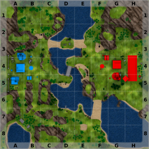
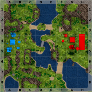
So about map sectors, how is this? I tried to keep it as non-intrusive as possible. It is a set of GIMP layers suited for 2048x2048, so whatever I do here is fully re-usable so you do not have to spend time setting this up again. Question is, will call-outs like "Enemies spotted in sector F7!" be a thing, and will they be useful? Maybe they would be useful if such a call-out also HIGHLIGHTED that sector on the map (when a map is implemented)? Edit: This is entirely assuming the MAP is full-screen. For abilities like the Chrono Tank shifting you want the map centered on your position to fit in a smaller window, and then you wouldn't see the grid names, and the lines might look confusing... So yeah, I don't know. Maybe this is one of those cases where "less is more". Edit2: I can see the sector call-outs working with recon tools; Divide your level up in 8x8 script zones that match the image grid, when your recon device projectile lands it checks in what zone it landed and sends a message to your team. Quite a bit of work though setting up those zones and fitting them into the grid, but I guess it is an option. Edit77: The more I think on this topic, the more I find myself leaning towards just having a clean map with no drawings, and encouraging players just communicate properly to do their teamwork. Perhaps all these drawings are just there to make the game [too] easy, and are more trouble than they are worth when it comes to hooking gameplay to them.
-
Well I have no idea how the actual logic works as I never touched it. I just think that using anything below 2k makes the images (as well as any 'texture') scale very poorly on most common resolutions. I believe it was also Pushwall who mentioned that higher resolution images result in more accurate selecting, so I figured I'd make a 2k stylized map as an example. If you can make the image centered then I cannot see any problems with this resolution any longer, and if 2048x2048 becomes the standard for all APB maps then this calculation thing you mention only has to happen once, right?
-
Yeah I was thinking of using some icons as well like gem and ore icons for those fields. The buildings could also be changed to have a building icon fitting within the building radius, but I decided to leave that in case the building status page ever ends up having that information presented on a map screen. Adding zones makes it confusing but adding "Attack Lane A" and "Attack Lane B" sign directions are certainly possible. You typically want to avoid image-baked full-sentence texts in the event you ever want to support localisation. Edit: @Romanov Is it possible to use 2048x2048 map images but when you open the map the image is centered around your current location? This way you wouldn't need to fit the whole image in your screen but just a ~500m radius, and by having the view centered around your position, you can then retain the graphical clarity that comes from having a high resolution map. Would be interesting to know?
-
Oh you know what I mean! Anyhow it is a concept, and easily reproducible for all maps. Most time was used on making the stylized textures but they are done now. The rest follows basic rules: Delete anything not relevant to collisions, like bushes, as they clutter the screen too much. Also delete anything not relevant to the 2D map such as collision meshes. Reduce the number of main terrain meshes to 4; rocks, grass, sand, water, and apply the materials as suitable. If a map has a darker shade of grass, just alter the material instead of creating another specific stylized grass (you'd end up having to make a lot of textures if you keep making new ones for each regular texture version). The process of creating the stylized textures is not a one click effort. Attach rocks to the 'rock' terrain mesh. Apply RGB green material to trees. Apply RNG blue and red to Allied and Soviet buildings respectively. Apply RNG grey to neutral buildings and misc props that do not belong in any of the above categories. Add a static scene camera, for detailed settings see the 3DS sample. For effect, add a skylight and enable ray tracing during rendering. In GIMP (or Photoshop), open the render result output, and if applicable, select bodies of water to add depth. For an example how to do this, see the GIMP sample.
-
It's a 2D map example, to replace screenshots made in Mammoth as @Pushwall is currently doing. It is not an actual level - it's just Guard Duty.
-
Yes, waffles taste great, I agree. As for the MiG, I hope it gets paired with the new lock-on mechanic, it will make it feel VERY "this isn't W3D anymore?!".
-
Well, here is a map... Have a map, tell me your thoughts, in words. Edit: GIMP source: (updated) https://drive.google.com/open?id=1W82bOvz8dbgf_SkWTXf-8io330L6j93f 3DS source: (updated) https://drive.google.com/open?id=1ag1_dJnb8TKuFkewCegXyExN1-EBH_ag Texture files for 3DS component: https://drive.google.com/open?id=1yWjvwp0LKCzmdHMycGLLR9dfutSsQNTF
-
On the screenshots thing. Would it not be possible to create stylized maps from a 3DS RENDER? A basic color coded mesh with some 2D style enhancements? I could think of a lot of ways to make this look appealing, the only drawback would be that you lose the ability to see finer details, notably transparency objects, but those are not relevant information to shifting anyway right? Maybe I'll do a test of this the coming week. Either way if you go down this path and say, you make 2048 a standard resolution for this, then perhaps Romanov could tweak the map system to always fit a 2048x2048 image perfectly?
-
So here is something I haven't seen brought up yet: When you Chrono Shift, your opponent is going to be more prepared for you, than you are for them, due to two reasons: As you select your destination, the target area is already highlighted by a shifting effect before you actually appear there. Unfortunately this is required for a lot of game logic. You shift in facing the direction and angle you shifted out at, this can lead to some disorientation while you try to determine where your opponent is in relation to your new location. So you shift in with a paper tank to an enemy (or more enemies - you cannot see infantry on the map), possibly facing the opposing direction of an enemy camping your shift-in spot. Naturally this means you're not going to have a fun time. So if for some reason a general armor buff is off the table, then how about applying a short duration armor buff (~4 seconds) to a recently shifted Chrono Tank? It sort of makes sense in a science fiction way, the space distortion caused by teleportation could result in a moment of not being fully present in the location of the teleportation, so while your Chrono Tank is "stabilizing", it is more resilient to damage (perhaps excluding Tesla/non-physical weaponry here which would also make it not a cheese counter to Tesla Coils). I imagine 4 seconds being enough to shift in, get spotted, finish the shift, get shot at, rotate to face your enemy and fire - and then the buff wears off. Edit: To state it in case I wasn't clear, the buff should only apply after shifting into a location, not during the departure of the previous location, else that would make getting out of a fight too easy. Lastly, bonus issue: The Chrono Tank map for Siege does not fit, a large amount of the map is not present in the screen, which makes shifting behind the Airfield impossible for example. Is this a limitation of the map system?
-
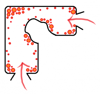
Linear pacing works well in games in which players are expected to interact with the environment on a predetermined path. APB does not always work like this and it really comes down to your level gameplay flow. I often refer to "attack lanes" when speaking of maps that very clearly have them, such as Coastal Influence, but a majority of APB levels are often not just "a set of lanes", and instead they are mostly one open map with a bunch of zig-zagging passable terrain, and the bigger that these maps are, the more complicated they become to work on (in many ways). So, say your design settles on using two predetermined attack lanes that may or may not intersect in select areas, doing so you can already calculate the amount of space you have to fill... But how? By making priorities. Lets say you have a tunnel, or a cave, whatever. You know that this tunnel is traversed from two directions only, no one comes digging through a wall into the tunnel right? So where can you maximize your time and performance-demanding aesthetics? Here be paint skills: Any surface that can come in direct view of a player should have your primary attention, and then from those points you gradually lower the detail, sort of like manually LoD-ifying your terrain. It does not just serve for performance or development time however, by making not every area 100% equally detailed, you help highlight areas that are intended to look nice, while also breaking up the pace in the scenery. No two hills look identical, after all.
-
Sounds like a registry thing. For level edit we used to have a tool that fixed this but I do not know if this tool is compatible with everything. What client did you base this on? Renegade? Best bet here is to see if Jonwil knows anything since he has a lot of experience with these sort of things. For what it is worth I have been pushing W3DHub a lot for a clean 5.x client with only the basic game functions so that it can function as a development platform. Right now if you want to do anything new, you have to rip APB, which isn't going to be pretty.
-
I imagine when you asked Sir Phoenix for a MiG model, his first reaction most likely was an assumption that the unreal engine switch actually happened. Back in 1977, airplanes in W3D became the front-line meme (in a time before memes were memes) for "nice things we will never get, because reasons".
-
Please check the match dates, often days went by before it was logged, same with Siege. Following the last round of changes the map barely got played, despite all of said changes having been based on the few bits of feedback I actually received (and despite me bringing those maps to Delta based on requests rather than my own desires). I get that the few times that it did come up, people did not like it, but since the last revamp the quantity of players to say so has been low given that it ran very rarely. I respected your decision to axe something that wasn't working for the vocal speakers here, but that doesn't mean I personally agree with the rationale behind it - or rather the lack of it since people are really awful at explaining WHY they do not like something, forcing me to make broad assumptions like "people do not enjoy core gameplay deviation". Anyhow, in short, it is very tricky to create content for such an audience, so I am following this topic closely as it develops. I'd like to see how a level, in which players had the opportunity to speak their mind very early in development, ends up when it is actually being played.
